Over the past few years, I’ve transitioned my career from government-oriented management consulting to the field of advanced analytics and data science.
In general terms, this has required me to climb a significant learning curve in the related areas of computer programming languages and advanced statistical methods. While it has been challenging, the rewards of being able to more effectively and efficiently extract insights from various types of information/data is encouraging.
With the objective of exploring my love of specialty coffee, I chose to practice a few basic data science methods on a relatively well-known specialty coffee review website: coffeereview.com .
The goal was to apply web scraping, text analytics, segmentation, and some visualization techniques to coffee review data in order to explore correlations between price, producer country, roaster, and quality over time.
My colleague and I discussed the objective over Memorial Day weekend and set out on parallel paths to scrape review data from the website. He used a Python script to scrape the website, and I used an R script to do the same. In the end, his Python script achieved a more efficient scrape, producing a column separated variable (.csv) file that could be imported into a statistical computing software package like SPSS or R.
From there, I cleaned up the file (using R packages such as “dplyr”, “stringr” and “sqldf” to get things to a point where we could calculate price per pound amounts and country of origin for most of the coffees reviewed. I was also able to pull down city/state location data for each of the roasters and their websites.
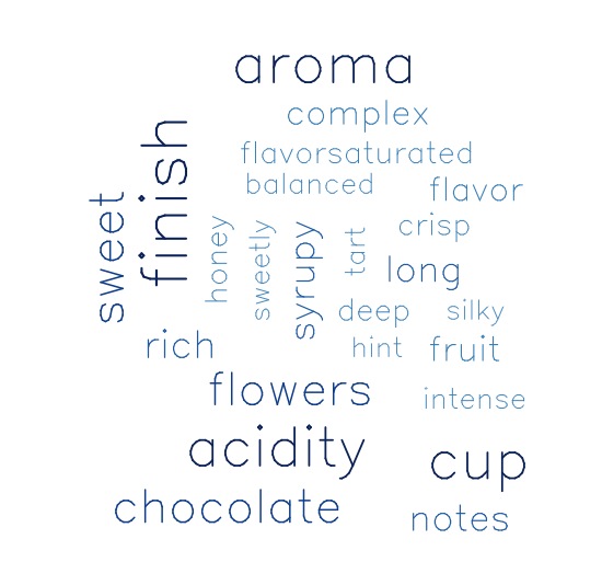
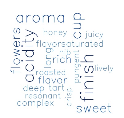
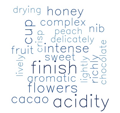
One of my first business questions involved the type of descriptive language used to review the website’s top-rated coffees. Where there any particular words that we could associate with the best rated coffee out there, according to coffeereview.com?
A relatively straightforward way to investigate that question is to use a Word Cloud to illustrate the words with the highest frequency of mention in individual review comments.

Most frequent words describing top rated coffees.
Clearly, if you want to appear to know the jargon for communicating your delight about a quality cup of java, you should say something like, “This coffee’s intense aroma of flowers, baker’s chocolate and fruit is only bested by its complex, rich flavor with tart tinges of acidity and a balanced, silky, syrupy, honey finish…”. Okay…so that sounds ridiculous…but you get the point.
Exploring the data
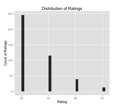
What is the range of ratings found on the top rated page?
The maximum rating any single coffee receives on this page (of highest rated coffees) is 97, while the minimum is 94. There isn’t a lot of variance. Most of the top rated coffees are rated 94, a third are 95, and the remaining15 percent are either 96 or 97. We will revisit this data later.

Distribution of Top Rated Coffees from CoffeeReview.com
What years of ratings do we have the most robust data for in order to do more specific analysis on our variables?
We decided to drop all years prior to 2010 (which had 29 coffees reviewed that year).
| year |
count |
| 2014 |
70 |
| 2013 |
58 |
| 2012 |
40 |
| 2011 |
39 |
| 2015 |
24 |
| 2010 |
20 |
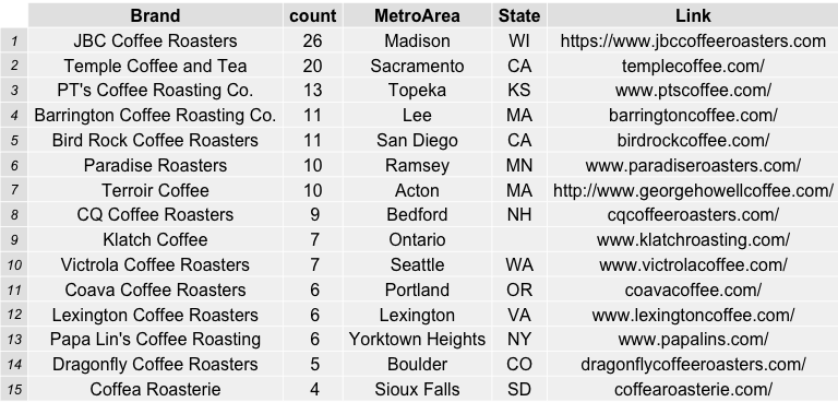
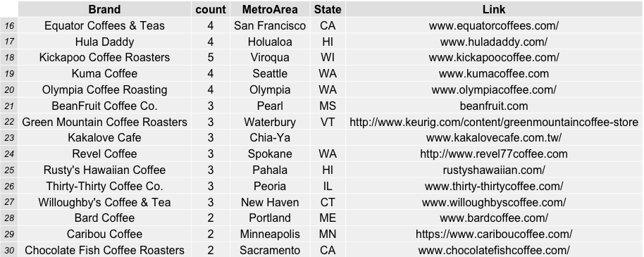
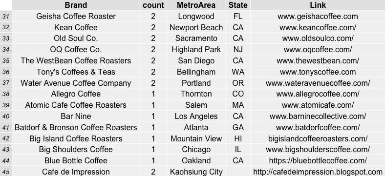
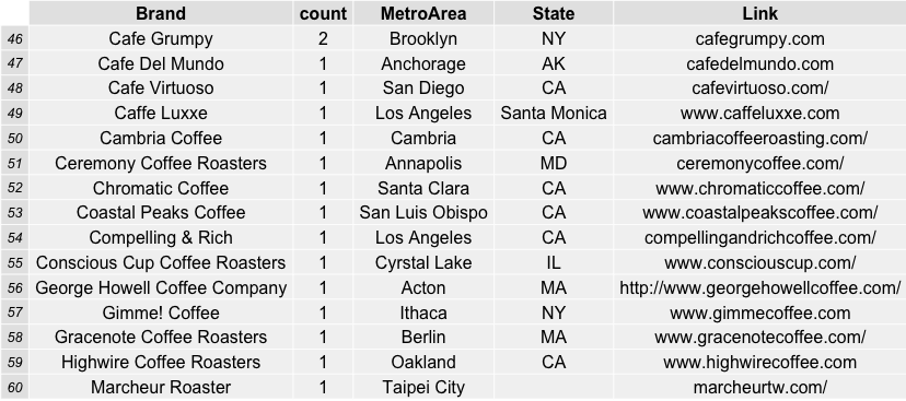
Which coffee roasters were the most frequently reviewed and top rated by coffeereview.com between 2010 and roughly six months into 2015?
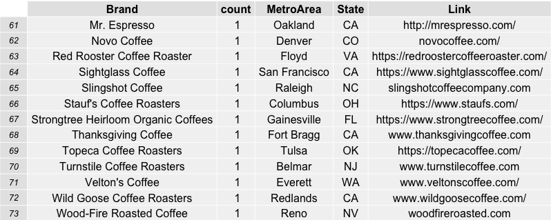
JBC Coffee Roasters from Madison, Wisconsin was the favorite by far in terms of its 26 reviews on the website in the time span specified. Followed by Temple Coffee and Tea in Sacramento, CA (20) and PT’s Coffee Roasting Company in Topeka, Kansas (13). This was a surprise to me, as I have never sampled ANY coffee from these roasters and feel like I have been missing out. In order to show the table of roasters, i used the combination of R packages “RGraphics” and “gridExtra” to save some nice incremental (sets of 15) graphics.


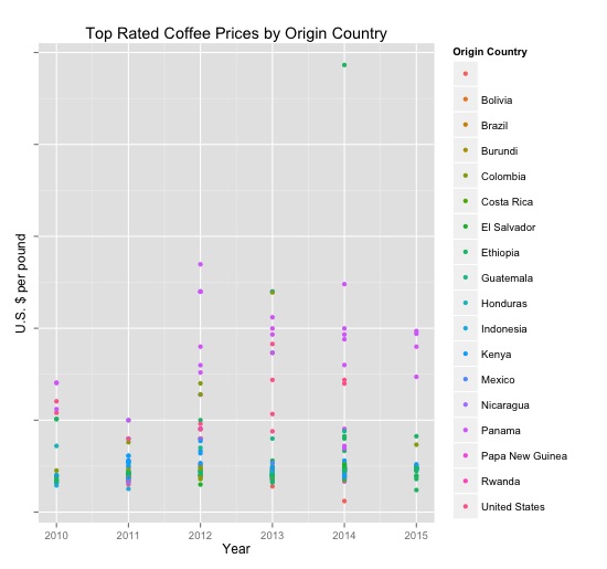
A quick visualization of the top rated coffees by year, price per pound and origin country shows some semi-distinct segments within the data based on price alone. This led me to ponder if we could use a clustering algorithm (such as k-means using dummy variables for each country, price per pound, and rating) in order to more clearly segment particular coffees by segment. Instead of using R for this exploration, I exported the data into a .csv and imported it into SPSS to run the analysis there.

Price per pound by origin country and year ($US). United States = Hawai’i.
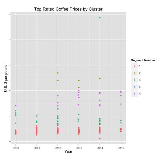
A five-way cluster solution seemed the most suitable for segmenting the data in a way that illustrated differences across price and producer country.

Price unreasonably drove the segmentation, as seen in this graphic.
The segments broke out into groupings containing the following number of coffee reviews each:
Segment Count $US/lb
1 174 $21
2 8 $121
3 35 $44
4 1 $243
5 20 $84
Segment 1: No Geisha or Hawaiian Coffees, Espresso Blends
Segment 2: Panama and Colombian Geishas
Segment 3: Mix of Geishas, Ethiopian, and Hawaiian
Segment 4: Semeon Abay Ethiopia
Segment 5: Mid-priced Geisha, Hawaiian and Ethiopian
Interestingly, a few roasters exhibited a bit of dispersion across the segments due to the variety of awesome tasting coffees they had reviewed. Those roasters included:
PT’s Coffee Roasting Co.
5 (Seg 1)
3 (Seg 2)
3 (Seg 3)
2 were (Seg 5)
Barrington Coffee Roasting Co.
3 were (Seg 1)
4 were (Seg 3)
1 was (Seg 4)
3 were (Seg 5)
Bird Rock Coffee Roasters
6 were (Seg 1)
1 was (Seg 2)
3 were (Seg 3)
1 was (Seg 5)
Paradise Roasters
6 were (Seg 1)
1 was (Seg 2)
1 was (Seg 3)
2 were (Seg 5)
After exploring the data in this way, I wondered if 1) my approach to segmentation was appropriate 2) what the comments from these segments looked like comparatively. To answer the first question: no, but that will be the topic of my next blog post. To answer the second, let’s explore some word clouds below.
Word Cloud: Segment 1
Word Cloud: Segment 2

Word Cloud: Segment 3
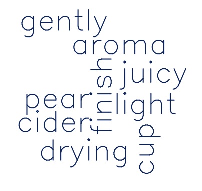
Word Cloud: Segment 4
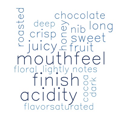
Word Cloud: Segment 5
Perhaps clustering by cupping notes is a better way to segment groups…stay tuned.